Chloe App Style Update
This is another minor style refactor/revamp project during my early days at 8 Securities.
When the Chloe App was first built, less effort has been spent on its UX aspect, leaving some quite obvious UX glitches and inconsistency. My objective was to revisit all these and implement in a rather short timeframe.
Some of the improvements covered:
- Better handling of image assets with css filters instead of having multiple duplications of the same image
- Cleaned up shades of different greys
- unified use of paddings/margins and a better overall use of spacings
- Better visual hierarchy with more precise use of typography
Welcome Screen

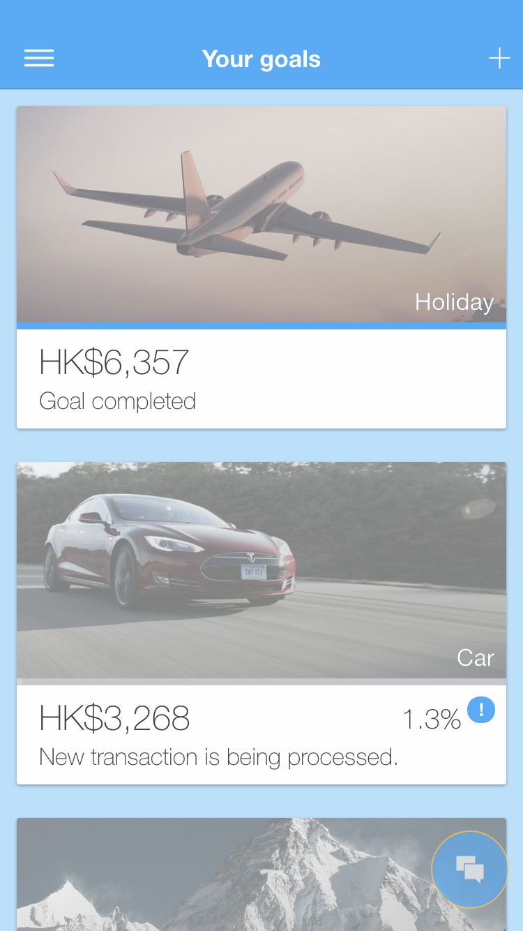
Goals list page
Portfolio page
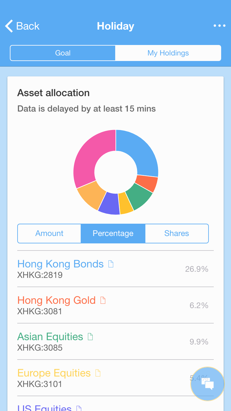
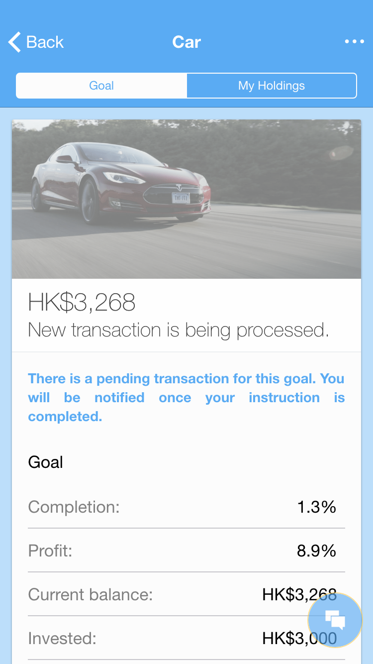
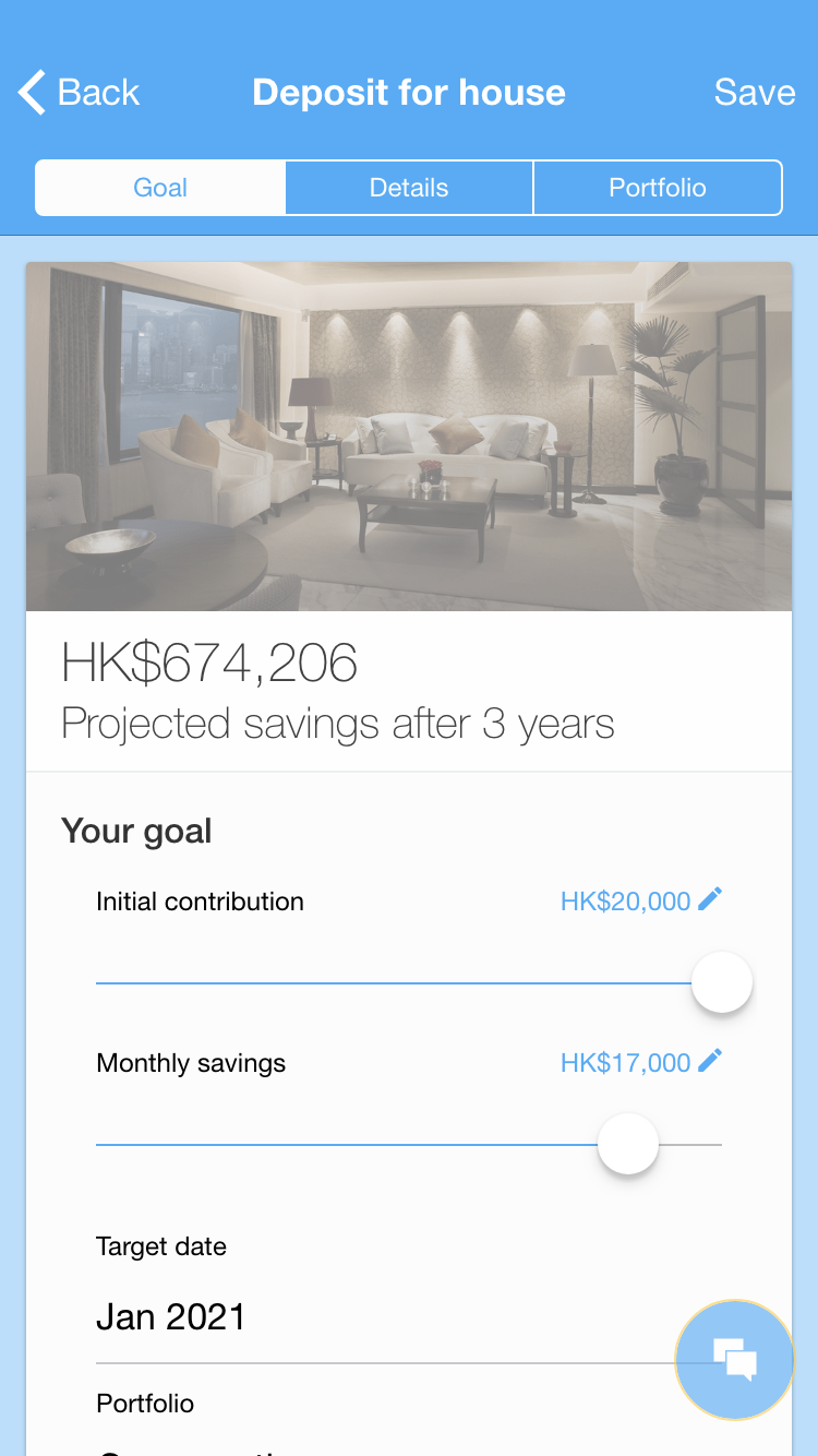
Goal detail page
New goal page
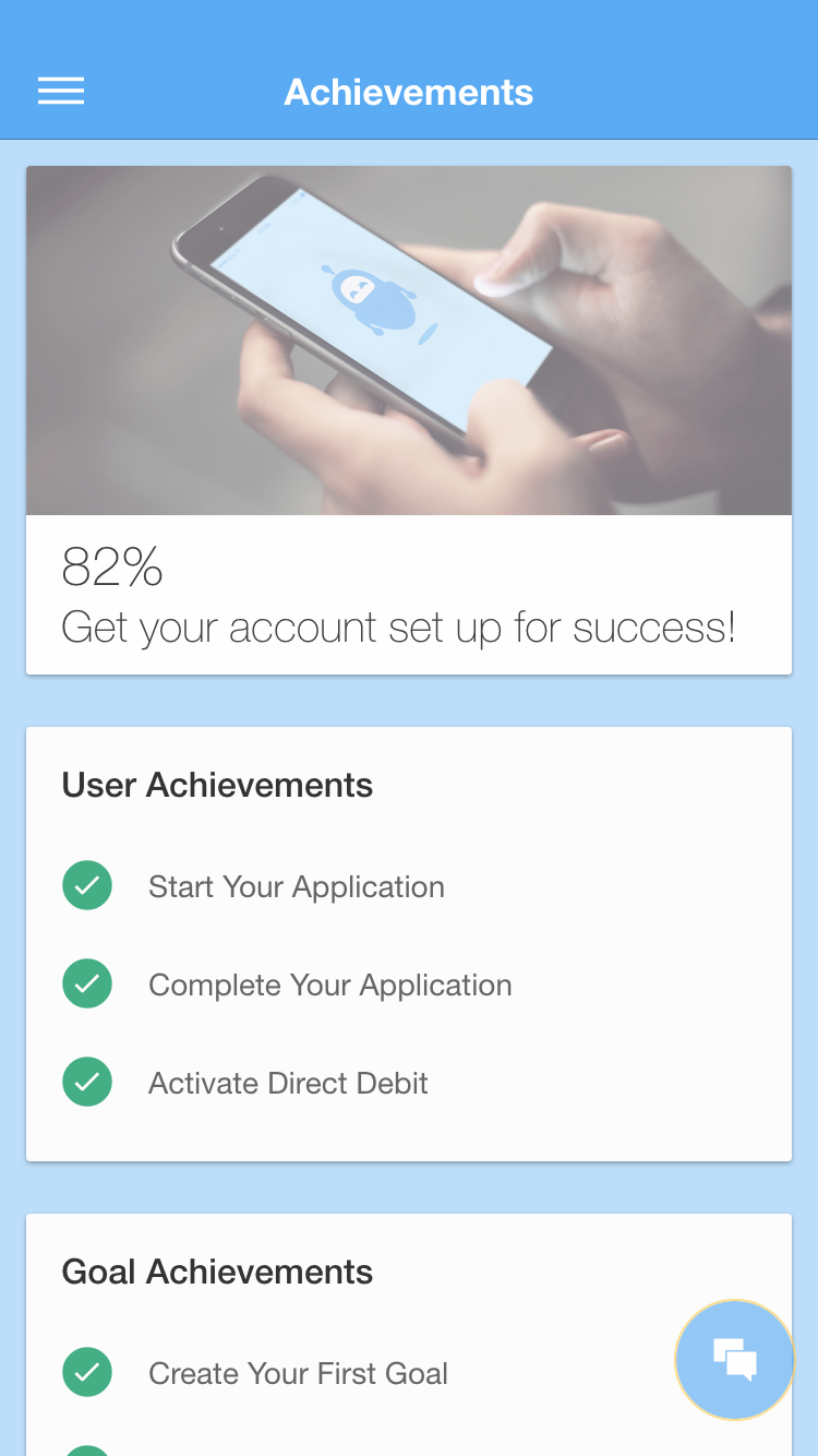
Achievements page