Chloe App Desktopification
This is my first project at 8 Securities. The objective was to explore the possibility to bring the Chloe app to the desktop with minimum modification of the original codebase.
Chloe is a robo-advisory app that aims to help the general public with investment advice, and makes investment only a few clicks away. The app offers a wide variety of portfolios, chiefly ETFs. Users can then choose according to their risk profiles, goals and timeframe.
With more and more users starting to use Chloe, there have been certain feedback from users that they would want to be able to manage their investment portfolios via desktop. The team then started to explore the possibility to "desktopify" the mobile app.
The Methodology
Chloe was build with Ionic, which is a framework that compiles any web based assets into mobile apps. So the frontend side of Chloe is essentially HTML, CSS and javascript. In theory it would be quite easy to convert the app into a desktop web app, and together with some of the latest updates from ionic at that time that facilitates desktop app building (which was the split pane layout and grids framework), it became even more plausible.
Ideation
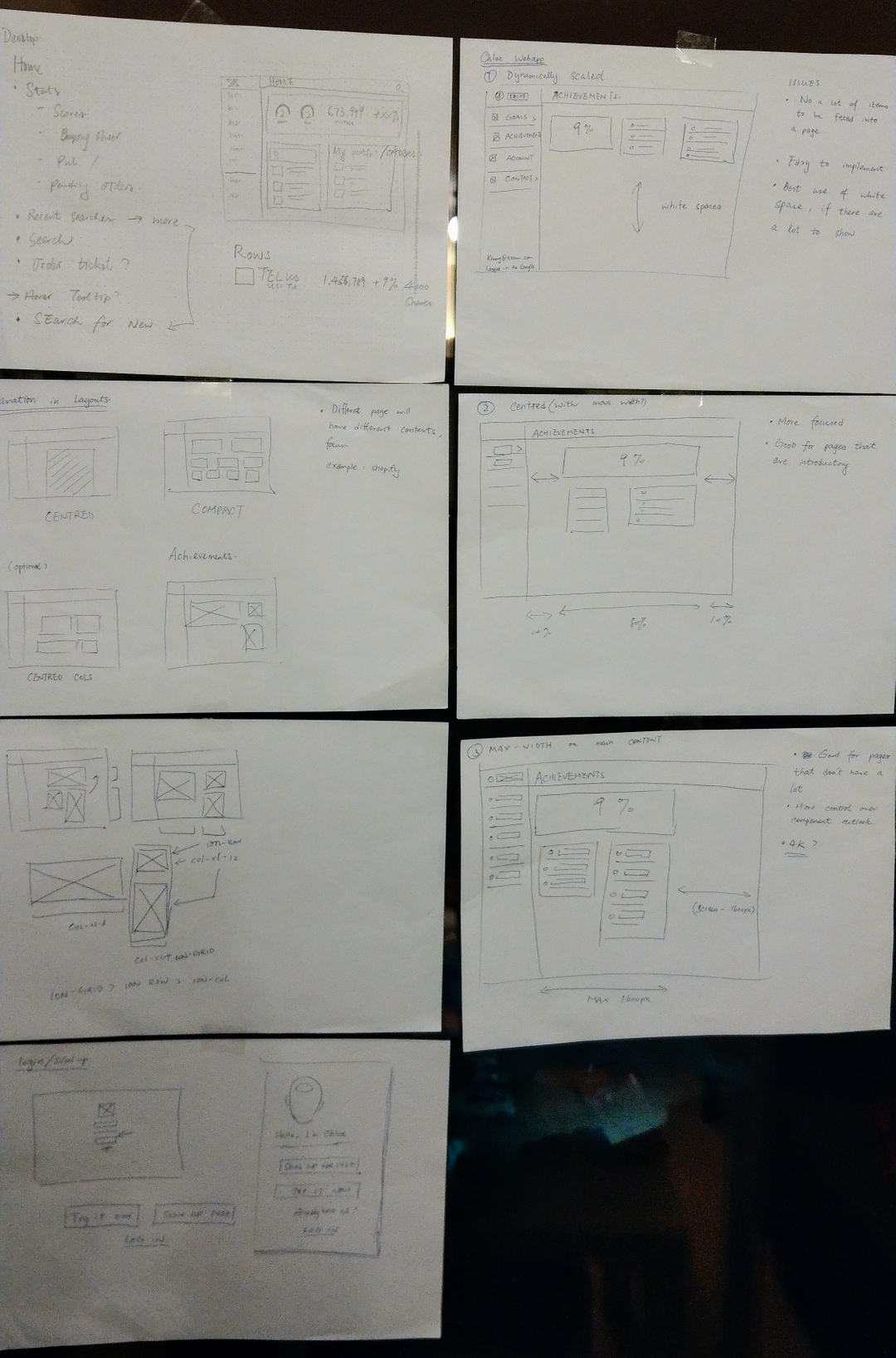
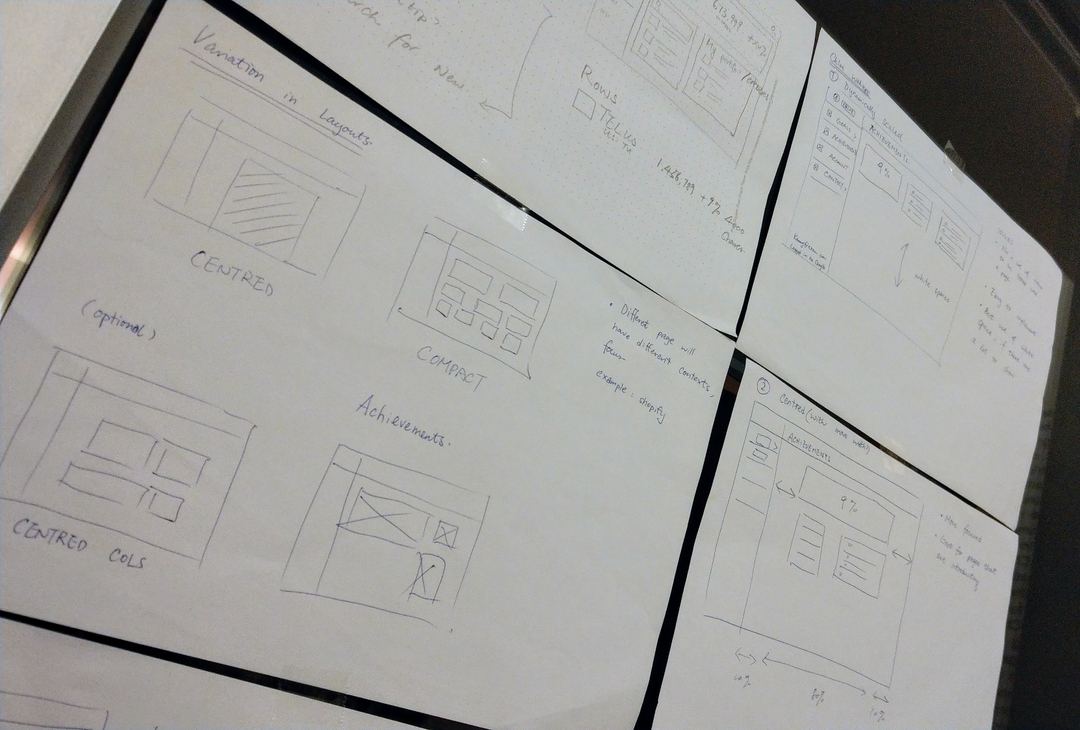
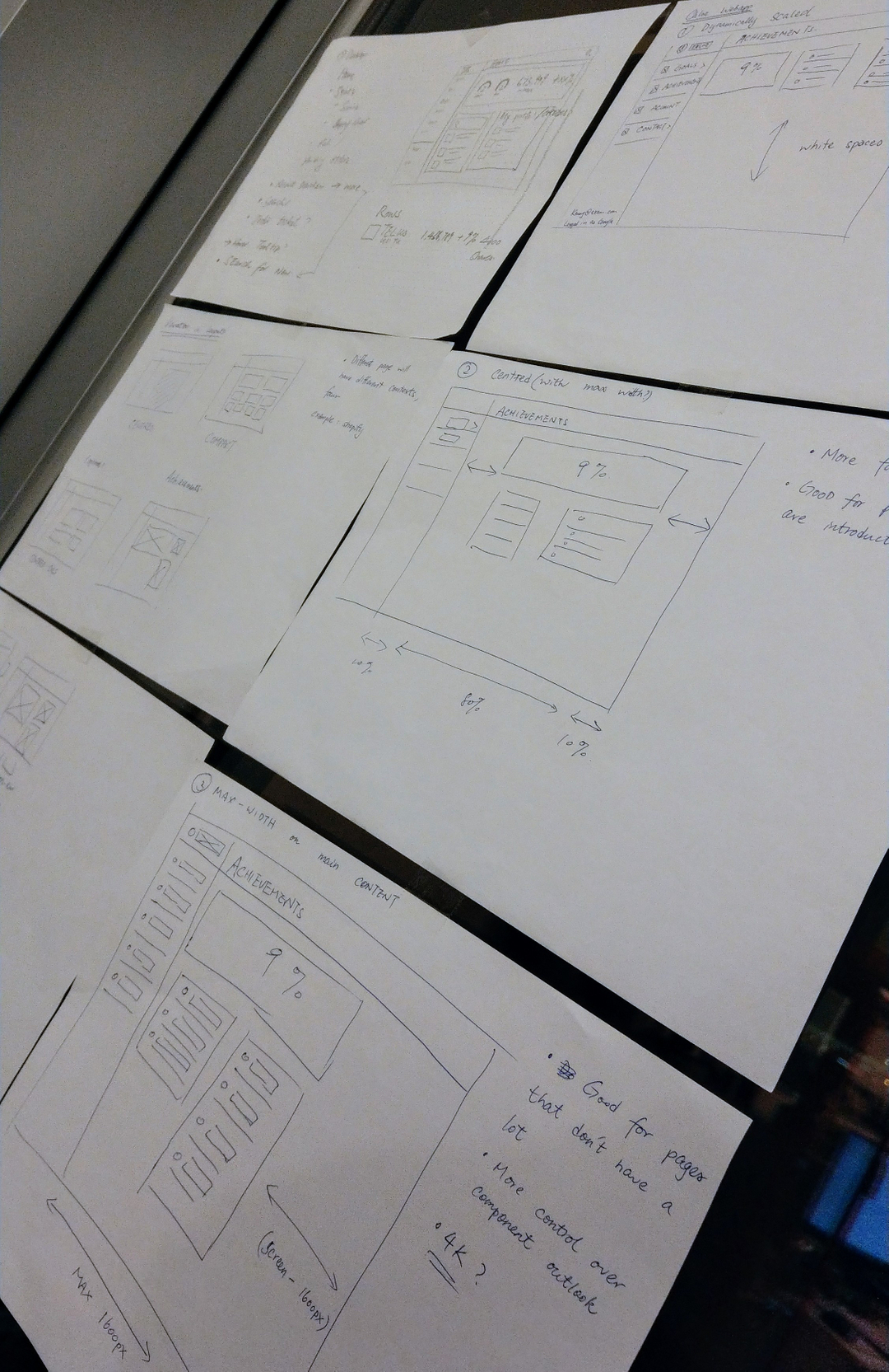
Several layout approach were suggested. At last, it was agreed that the development should be kept with minimal effort without too much sacrifice on aesthetics. Thus a similar single column layout was used, with some tweaked multi-column treatments on particular pages.
Implementation
Welcome Screen
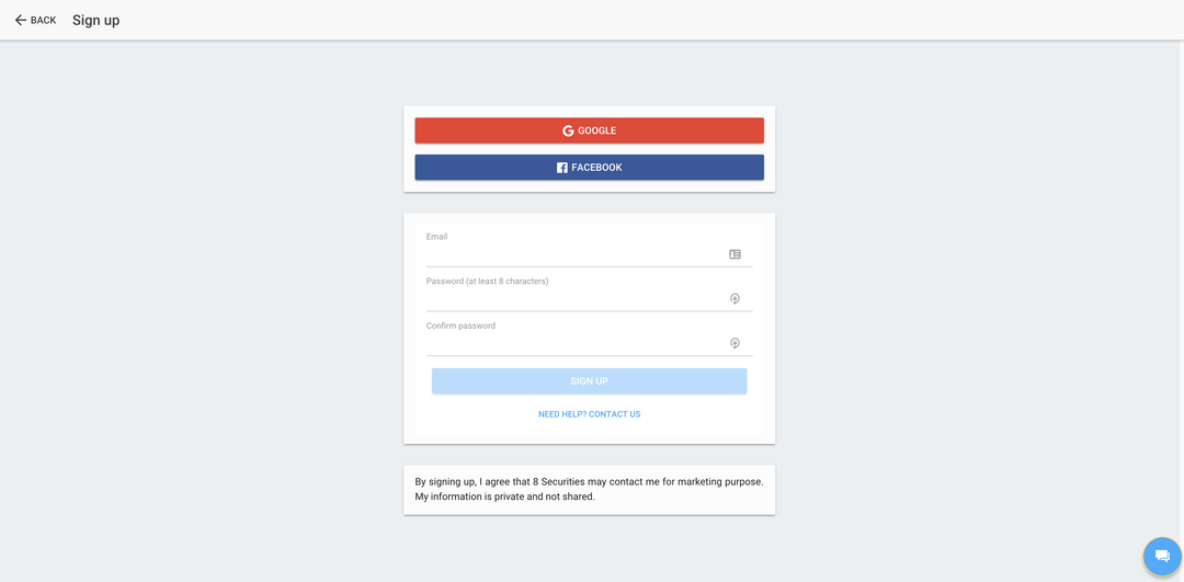
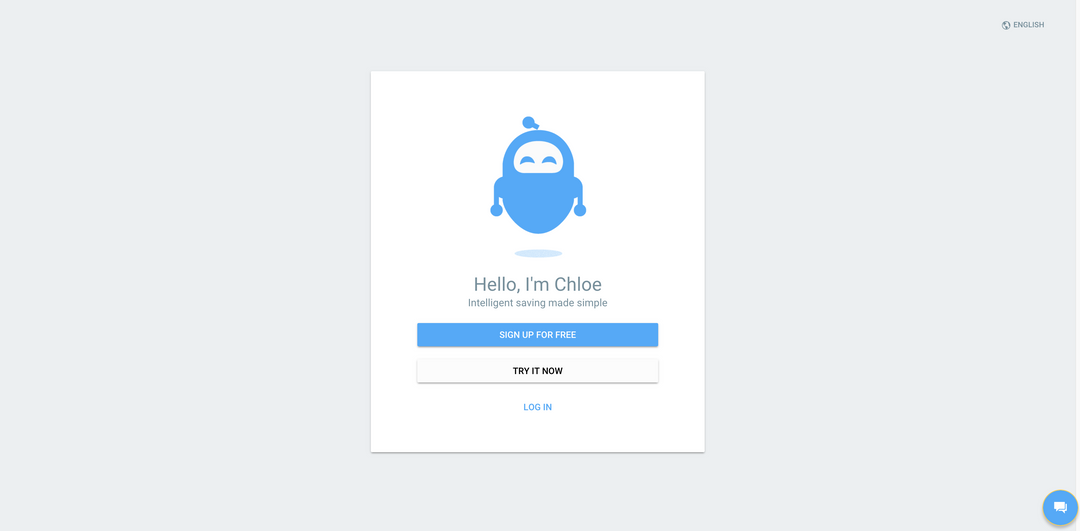 Login Screen
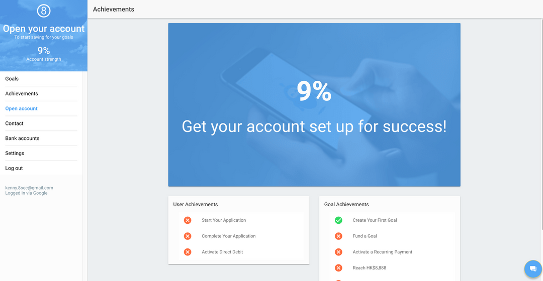
 Achievements – example layout
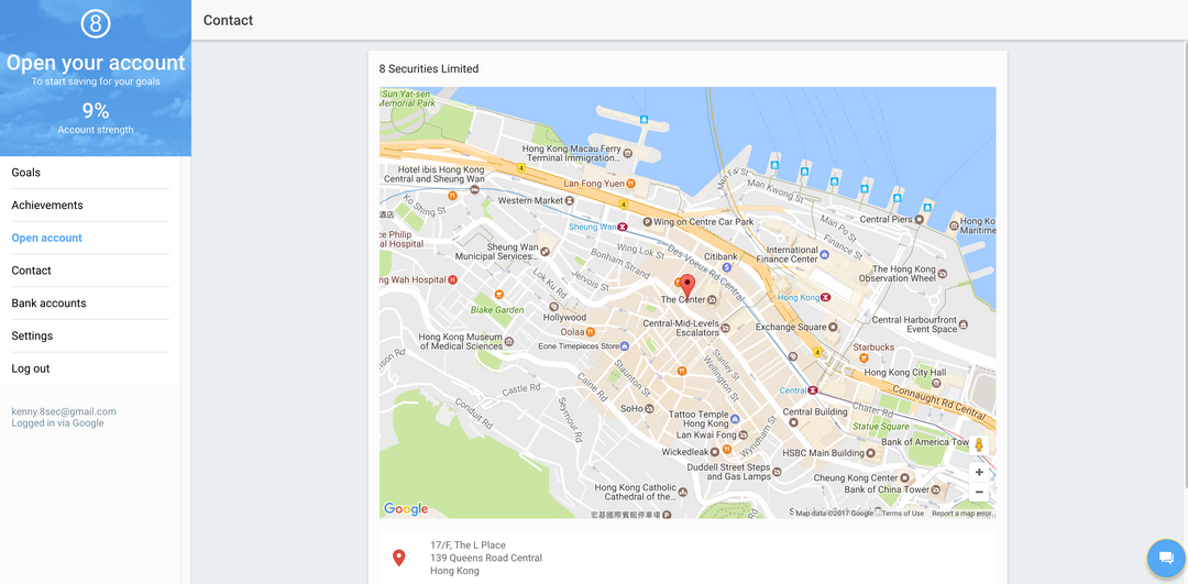
 Contact page
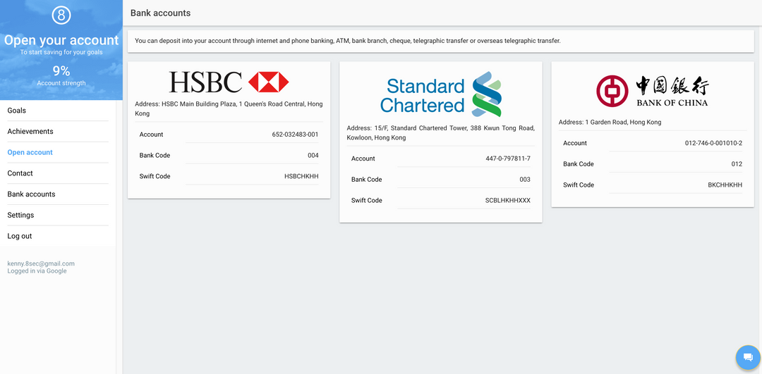
 Banks page
After Thoughts
This had been a fairly good starter for me as a UX developer. I got to know the possibilities of this powerful framework Ionic and alongside acknowledge its limitations. I also started to realise the significance of my role in a small development team (merely five at that time). With such a small team things are going pretty rapid and constant communication is the key. Also before my joining not much effort was spent on the UX side of the product, thus I played an important part in contributing UX insights and having them implemented at the same time.
