WeConvene UI Font Studies
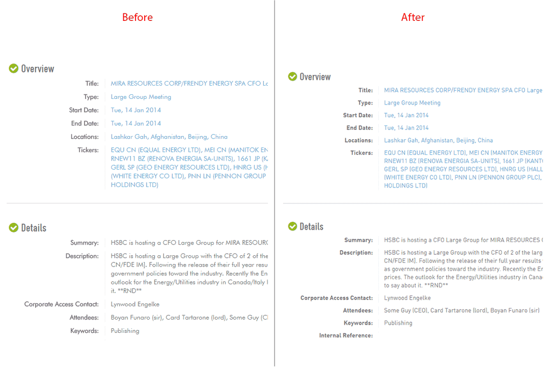
When I first joined WeConvene, it was at its rather early stage — style guides were loose and stylesheets were all over the places. One major issue I noticed was the choice of UI fonts, at the time the body copy was set in Futura. I am a fan of Bauhaus design and geometric fonts, they are fantastic with headings and always remind me of the pragmatic philosophy of “form follows function”, Volkswagen and all. However the problem with applying Futura to the body is that it hinders quick reading/scanning. WeConvene is a platform for the finance industry, and as we know that financial people are meant to cope with huge amount of information at merely glimpses. From my observations Futura doesn’t seem to be the ideal candidate for such purpose — it is too geometric(with almost no humanistic hinting) and stylish a body font and some of its glyphs are ambiguous in small size.
Futura font, notice the word “Illinois” and the letter “j”
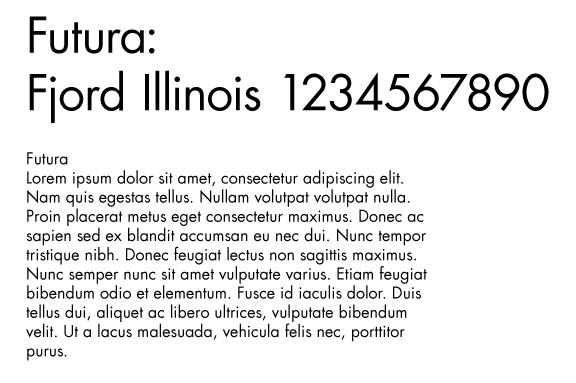 There had been cases where testers mistakenly thought the “j” has been cut off
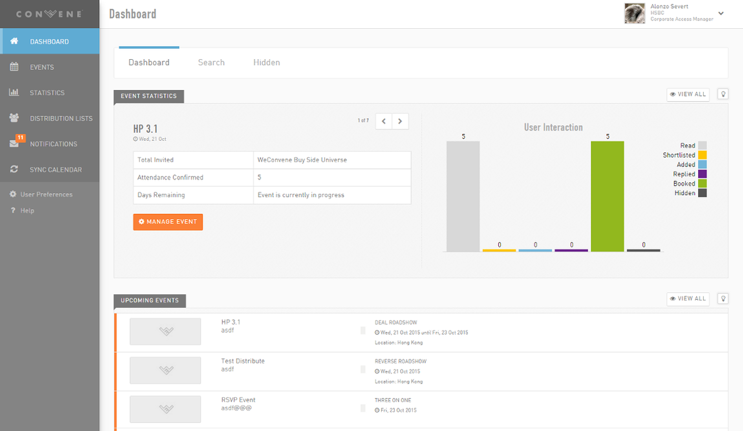
 The app dashboard in Futura
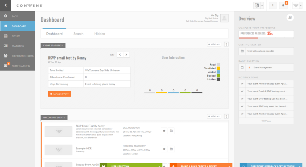 Whereas for headings, we’ve been using a variation of DIN Condensed from Typekit.com. The DIN type family has been renown for its perfect legibility.
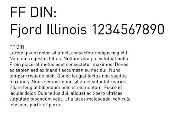 After some research on the history of DIN, we found that it is actually a much better choice than Futura — strictly designed by the German Institute for Standardisation, it was a font made for fast scanning and has been widely used in road signs and signage systems. Having been informed with these quick facts, our CEO was glad to accept DIN as our new UI font.
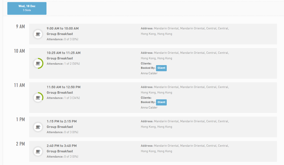
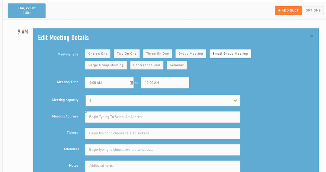
Here are a few snaps with DIN applied.
